- MENU
- HOME
- SEARCH
- WORLD
- MAIN
- AFRICA
- ASIA
- BALKANS
- EUROPE
- LATIN AMERICA
- MIDDLE EAST
- United Kingdom
- United States
- Argentina
- Australia
- Austria
- Benelux
- Brazil
- Canada
- China
- France
- Germany
- Greece
- Hungary
- India
- Indonesia
- Ireland
- Israel
- Italy
- Japan
- Korea
- Mexico
- New Zealand
- Pakistan
- Philippines
- Poland
- Russia
- South Africa
- Spain
- Taiwan
- Turkey
- USA
- BUSINESS
- WEALTH
- STOCKS
- TECH
- HEALTH
- LIFESTYLE
- ENTERTAINMENT
- SPORTS
- RSS
- iHaveNet.com: Interior Design
The Art of Accent Colors
Certain colors innately evoke different memories, thoughts or moods, according to a study conducted by Miami University.
If your home is laced with walls that are too white or overbearingly dark, details in your décor can change everything.
By recognizing this, it is easy to brighten up or give any room a little extra personality with accent colors.
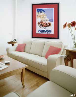
Barbara Schmidt, a nationally recognized interior style consultant whose work has appeared in "Architectural Digest," "In Style," "Elle Décor," and "Metropolitan Home," suggests when adding color to a room the use of pillows, throw blankets and, most importantly, art helps to brighten any space.
"People are more and more sophisticated when it comes to color and decoration," she says. "You can’t just hang up plain artwork anymore and have it look like it’s a finished room. You really need to look at your color scheme and bring complementary or blended colors into your framed art."
The executive director of the Pantone Color Institute and founder of the Eiseman Center for Color, Leatrice Eiseman, agrees.
"Specific colors have the ability to bring out excitement, happiness, relaxation and even aggression," says Eiseman. "That is why the colors you use in your home are so important. They should represent your personality while creating an environment that inspires you."
"There is a reason that when people see yellow they think happy. Green is automatically fresh, and red is romantic, hot or appetizing," says Schmidt.
"Depending on the colors you use, your room will have a different vibe."
Consider these decorating tips from Schmidt when adding color accents to any room.
"Primary colors on a white wall can make a room look juvenile; subdued colors always end up looking more sophisticated and calm," she says. "When having a piece professionally custom framed, remember that less contrast between the art and wall provides a more classic look."
"If you are dealing with a plain white or beige wall, consider matting all artwork using the same accent color. Even if the art isn’t related, a gallery is created through the matboard."
"Hang art in white lacquered frames with white matboard against a brightly colored wall. There will be a nice contrast while creating a cohesive focal point. For a bright color, kelly green is very trendy right now," says Schmidt.
Schmidt reminds consumers to use professional custom framing to help art keep its integrity.
"Guaranteed safe next to any piece of artwork, Crescent’s 100 percent cotton RagMat matboard makes the art larger, more colorful and adds a visual pop of color," she says.
Lastly, Schmidt recommends custom framing for more than just artwork.
"Taking any meaningful item to your professional custom framer can enhance not only that item, but bring new color and life into any room."
Home & Garden [...]
AUTOS | HOBBIES | EDUCATION | FAMILY | FASHION | FOOD & RECIPES | HOME DECOR | RELATIONSHIPS | PARENTING | PETS | TRAVEL | WOMEN
Explore More Home & Garden Ideas
- How Architectural Details Increase your Home's 'Wow' Value & Selling Value
- Interior Design for the Sports Lover
- Planning A Screened-In Porch: What to Consider
- Two Main Forces Working Against Your Retaining Wall: Gravity and Frost
- When Installing a Patio, Build It to Last
- Power-Wash the Deck or Do a Green Clean? The Pros and Cons
- How to Make the Most of Your Kitchen
- Green Building Options from the Ground Up
- Put the 'Eco' in Decorating
- Add Warmth and Value with Easy Weekend Projects
- How to Freshen Up Your Home and Brighten Your Mood
- Hot Home Decorating, Color Trends and Tips
- Kitchen Color Trends and Tips
- The Art of Accent Colors: How to Use Color to Brighten a Room
Home & Garden [...]
The Art of Accent Colors - How to Use Color to Brighten a Room Trends
Article: Copyright © iHaveNet.com